DJALCHEMI
2 April 02004
E-commerce usability
Last week I resolved a dispute with an e-commerce service provider after two weeks of email arguments and contacting several third parties. The dispute hinged on the usability of the page on the retailer's web site that came up when I clicked the 'cancel membership' button: the page left me with no obvious next step, so I assumed my cancellation transaction was complete and left it that.
When it transpired a few days later that the transaction had not been recorded by the system, and that I'd been billed for a further month's membership which the service provider was unwilling to refund, there followed the email arguments (21 messages exchanged between us), the letters to VISA and the provider's 'affiliate programme' partner, plus a report to Trading Standards.
There are lessons in this story for e-commerce providers and for consumers.
What Happened
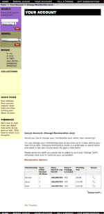 Four days before my existing membership period was due to end I went to the provider's web site, and clicked the 'cancel membership' link in the 'your account' section of the site. Click on the thumbnail to the right to see the salient section of the page that I saw next (the masthead and some other navigation links have been removed to protect the identity of the provider). I would argue there are several points in the design of this page that could confuse a user.
- When shown in web browser on a 15" screen, only the top half of the page is visible, and this contains no text. Some users might stop there: "I clicked 'cancel membership'; it looks like my account is now blank, so I guess that means I'm done."
- If the user scrolls down, the text "Cancel Account: Change Membership Level" may not seem relevant to someone who has just declared a wish to cancel, so some users would be likely to skim the text of skip it completely.
- If the user reads the text, it says "click here to continue your cancellation" but there is no indication of where "here" is, and the nearest clickable button to this text says "change tarriff", so users who want to cancel are likely to decide that they should not click there since they don't want to change tarriffs.
- The only way that the cancellation will in fact be processed is if the users clicks the link "No Thanks." But this link is hidden at the bottom of the page, it is in grey/green text (less contrast with the background than the other text on the page), and it is not immediately clear to what it refers. Users are unlikely to click links where the consequences are not clear.
In fact — as I found when I finally processed a cancellation successfully (two days after I'd been billed) — even if you clicked "No Thanks" on this page, the next page required you to re-confirm the cancellation command a third time before it was actually processed. Clearly this provider wanted to give members alternatives to cancellation, but in doing this they created obstacles to cancellation that in my view were misleading and unreasonable. For users who wanted, in good faith, to cancel their membership, the design of the site had very poor usability.
Towards the end of last week I received a phone call from the provider, and they undertook — without further condition — to refund my membership charge, to discuss changes to the web site design with their technical staff, and to investigate registering with a scheme using the TrustUK e-hallmark.
Advice for Providers
There are plenty of sources of advice — free and otherwise — on providing a professional e-commerce service. A Google search on e-commerce and usability is a good place to start. Here's one free document on business-to-consumer transactions.
A common thread in all the advice is the need to establish trustworthiness, and many of the means of achieving this are common sense. Transparency is one method — and one I would argue was missing from the web page above. You need to make it clear all the time (not just in the fine print of the terms and conditions) under what circumstances the customer is making a commitment or confirming a transaction. Obviously if customers perceive that you are creating hurdles for particular actions, or encouraging different actions from the one they have selected, this will undermine their trust.
Responsiveness is another key factor, especially being alert and sensitive to when things go wrong. Two of the heuristics for usability are to prevent users making errors, but also to provide means for users to recover from errors if they make them (because they will). This applies to human support as well as to automated report. Unfortunately in my case, the customer support staff were clearly operating in a call-centre environment following a strict manual of 'approved responses': they might as well have been automated, because I guess they weren't authorised — or encouraged — either to acknowledge and remedy an 'error' in the system, or to refer it.
It's important to provide customers with clear means to report problems, and to have customer support staff well trained to recognise issues that might need to be referred. In the course of the eleven emails I received from the provider, the responses both requested information that I had already provided, and contradicted each other in the accounts they gave of their side of the story. There are few better ways to destroy customer trust than to demonstrate in writing that different representatives of the company are not aware of what each other has said.
Another means of establishing trustworthiness is to sign-up for one of the third-party validation schemes that allow you to display a kind of 'trust hallmark' once they have picked apart and verified all your business processes against a code of practice. TrustUK is the best established scheme in the UK. There are different codes for different sectors. Customers then have the reassurance that they can complain to a third party if they feel a provider has breached the code.
Advice for Customers
As a first step, customers should be aware of their rights and some general guidance. The UK Internet rights web site has a useful useful factsheet with free briefing for download, which includes useful advice at the end, like using a credit card rather than a debit card, and recognising that your rights are better protected if you use a provider based in the UK or European Economic Area.
I wrote to my VISA card company to complain about the transaction mentioned above, and they credited my account before pursuing the issue with the provider.
Obviously it helps if you can find a provider that uses the TrustUK e-hallmark or one of the associated accreditation schemes like Safebuy. These aren't well established yet, but you can apply pressure to encourage take-up. After the incident mentioned above, I wrote to the advertisement director of the magazine that had an 'affiliate' relationship with the e-commerce provider, and asked him to exercise greater caution in partnering with such providers, using TrustUK accreditation where possible.
Always keep dated records of each transaction you make, even (or especially) if the e-commerce web site doesn't give you a reference code or send you an email. If I hadn't had a screenshot of the cancellation page I saw when I attempted to cancel, I would have no evidence to support my claim.
Be prepared to write letters, especially to third parties, to help get recompense if you have a grievance. I contacted my local Trading Standards office and they were sympathetic but did not follow up rigorously. They're probably overworked and the range of complaints they have to sift through means they cannot be experts on everything, particularly the finer points of web page usability and online transactions. Much more effective, in my experience, is to write to one of the other businesses in the provider's trading chain. For example, if your grievance is with a hotel, write to the travel agency, magazine or other web site through which you first became aware of the hotel. No matter what they say, providers are often prepared to piss off individual customers whereas they protect their reputation with their associate businesses much more carefully. When I wrote to the advertisement director of the magazine that promoted the provider's service to me, he forwarded my letter to the provider for a response — as I'd hoped he would — and I'm sure this had an impact because the provider explicitly referred to this letter when they called me.
Posted by David Jennings in section(s) Human-Computer Interaction on 2 April 02004 | TrackBackSubscribe to my RSS feed, which covers this blog, my book blog, and further commentary on other web resources (more feeds below)
Fred Garnett on how to create new contexts for your own learning
Elaborating on Agile Learning
David Gauntlett on "making is connecting" and the end of factory learning
Dick Moore on Agile Learning, Agile Software Development and the Mobile Internet
Agile Learning: better results for less money
University of Death by Sean McManus: A Review
Counterculture, Cyberculture and Innovation: the strange case of Stewart Brand
More on self-organised learning
Reflections on Longplayer Live
Progressive austerity and self-organised learning
Round-up of talk and interviews
Applying the lessons of Last.fm to libraries and learning
Support Longplayer Live
Social media old and new: two contrasting networks
Cinema (24)
Cultural Calendar (86)
Curatorial (66)
E-learning (89)
Events (34)
Future of Music (95)
Human-Computer Interaction (62)
Ideas and Essays (36)
Long Now (17)
Miscellany (41)
Music and Multimedia (156)
Playlists (27)
Podcasting (12)
Politics (12)
Radio (48)
Reviews (54)
Social Software (59)
Teaching (20)
Alternatively, see the Date-based Archives
Recommended: RSS feed that combines items on this site, my book blog, and commentary on other web resources

RSS feed for this site only
RSS feed for my book, Net, Blogs and Rock'n'Roll
RSS feed for shared bookmarks
My latest bookmarks (click 'read more' for commentary):
My archived bookmarks (02004-02008)
On most social sites I am either 'davidjennings' or 'djalchemi', for example: Flickr, Last.fm, Ma.gnolia and so on…
Lateral Action — managing creativity
Herd — social cognition
Seb Schmoller's e-learning mailings
Viridian Design Movement
Tom Phillips — artist
Long Now blog — resources for long-term thinking
Longplayer live stream — 1,000-year composition

The contents of this site are licensed under a Creative Commons Licence except where otherwise notified.
Hosted by Paul Makepeace
W3C Standards
Check whether this page is valid XHTML 1.0
Check whether the CSS (style sheet) is valid