17 April 02006
Visualisation of music collections
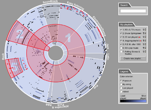
 The picture on the left is an annotated version of a possible visualisation of someone's music collection, as proposed and described in a research paper available from Musicstrands. The segments in the circle represent different genres of music within the collection; the distance of each track (represented by dots) from the centre shows how old or recent it is; adjacent tracks all come from the same album; and the colour highlights show whether a track is part of a current playlist. I've shrunk the image down to about half size, partly to minimise accusations of infringing the authors' copyright, but also to give some indication of what this visualisation would look like on the screen of a mobile phone, iPod or other handheld device — not much use, I think you'll agree (download the paper, 580 KB pdf, for full-size image and explanation). I take that as reinforcement for my instinct that iPods, phones and such like will not be the main music device for serious music fans (people with more than a thousand tracks), but will continue to be just portable playback devices.
However, I'm not writing here principally about music devices, but about music visualisation in general, and assuming no particular constraints on screen size. I'm interested in visualisation for people organising and managing their own collections, sharing them with others and exploring others' collections, plus generalised visualisations of what might be called the 'music universe' (i.e. all the tracks and artists in the world), and how music maps onto other non-musical domains.
Some of this started to crystallise for me when Zac Johnson encouraged me to look at AllMusic.com's Tapestry playlisting demo (Zac contributed some really interesting comments to my post about music recommendation data, and also has a personal blog). There are lots of interesting things about Tapestry, some of which I may come back to another time, but one is that AllMusic.com are not offering Tapestry as a self-standing service: they are offering the data and models that underpin it to third parties. For example, as the FAQs explain, a device manufacturer could license the Tapestry technologies to enable their users to manage their own collection, auto-generate playlists and suchlike; or a subscription service provider could use Tapestry to give subscribers an extra, interesting and easy way to explore the service's catalogue.
Elements to include in visualisations
It's really worth playing around with the Tapestry demo a bit yourself, but just from looking at the screenshots, you can see that the main elements are thumbnails of album art, track and artist listings, and some descriptive review text.
In a similar vein, the iTunes Catalog software gives users an easy means to link artwork to their tracks, find lyrics and so on, and also enables them to publish their iTunes collections showing that artwork and the track collections. Here's an example of an alphabetical list, and here's one organised by genre. With iTunes Catalog you can also emulate the iPod display: quite why anyone would want to emulate a 2.5" menu-based interface on a 17" WIMP interface is beyond me — perhaps hoping for some iPod-cool to rub off — but I bet some people do.
Getting away from text
To my mind, even the iTunes visualisations of collections produced by iTunes Catalog are slow, kludgy and rather dull. As Paul Lamere writes, "Probably the worst way to browse through a music collection is by having to read through long lists of words" (my emphasis; Paul was the other contributor of valuable comments elsewhere on this site a couple of weeks ago). He points us in the direction of Coverflow software, which aims to emulate some of the physical experience of looking through the covers of someone else's CD or LP collection.
The rolodex look of Coverflow reminded me slightly of the demo of the BBC's new software for managing and sharing collections of TV programmes. Here's a video of the demo: the action starts about 5 mins and 45 seconds in, and runs for just over four minutes (here's the associated news story). TV programmes are not the same as albums, and people want to do different things with them, but it's interesting how access to the 'shared/available' collection and the 'personal/downloaded' collection are handled through the same interface.
Tags
User interface design is subject to trends and fads, as with all other kinds of design, and one of the favoured visualisations of the Web 2.0 fraternity is the tag cloud. Here, for example, are the Tubetribe tag cloud and the Musicstrands tag cloud. Last.FM has a chart of popular tags.
Tags are useful for picturing and negotiating the relationship between an individual's collection (the range of tags they use most commonly) and the wider, 'social' collection (as shown in the above examples).
Graphical representations of tracks
Like Paul Lamere, the authors of the Musicstrands research paper are interested in alternatives to text lists of tracks or artists. Their paper describes and compares
three different ways of graphically visualizing music libraries considering five criteria (thus, five dimensions) which are genre, artist, year and a quantitative criterion to be chosen by the user such as playcount, rating, added or last played date. The goal of these visualizations is two-fold: a) to give an overview of the contents of a music library, and b) to visualize playlists and give some support to manage and organize them.
One of the ways is the disc visualisation shown at the top of this page. The second is similar, but projects the tracks onto a rectangle instead of a disc, which allows a different kind of zooming in on areas of the visualisation. The third is based on Ben Shneiderman's tree-map visualisations. I'm not going to go into any detail on the pros and cons of each — see the paper for that — though I did wonder whether, given the stated aims of giving support to manage and organise playlists, these visualisations could be used as a basis for direct manipulation of tracks (e.g. highlighting one or more of them from a visualisation and dragging them into a playlist).
Graphical representations of artists
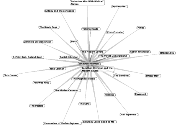
There are a bunch of sites that aim to show the connections between related or similar artists through network or affinity diagrams. Examples include MusicMap, music-map and the Audioscrobbler browser (from which an example is shown below). These are effectively doing the same as the music recommendation services I discussed ten days ago, but with the results shown in two dimensions rather than one. This adds a representation of the relative 'distance' between two artists, and makes it easier to follow a chain of links, but appears to have little extra value beyond that.

By comparison, the History of Sampling has a very specific function — showing who sampled who, and how far apart they were in history — but it's both elegant and interesting in the way it encourages you to think of musical space and time in an unusual way.
As a bit of fun, Dorian Lynskey set herself (himself?) the challenge of representing the connections between influential artists using the London Underground map. The result is as tantalising, frustrating and ultimately frivolous to read as it must have been to produce.
It does, however, remind us that showing the connections between bands did not just begin with the Graphical User Interface. Pete Frame's family trees were justly famous for decades before the web took off: see, for example, his classic Californian country rock tree.
Location mapping of music
And following the Pete Frame thread, possibly slightly off the topic I set for myself, I come to his book Rocking Around Britain, which is a kind of gazetteer of the rock history connections of different places in the UK (you can use Amazon's 'search inside' feature to browse some entries). Now, instead of mapping music onto blank screens or blank paper, why not map it onto maps or physical locations? With their GPS-enabled handheld device, music fans could wander round the streets of London receiving alerts each time they came close to the spot of a defining moment in the careers of Jimi Hendrix, David Bowie or Bon Scott. (I've always thought that something similar for highlighting the locations used in feature films would have a big tourist market.)
Mixing visualisation and narrative
I didn't create it as any kind of exercise in visualisation, but it occurs to me that my Music Arcades blog combines elements of visualisation (at least in the album artwork) with narrative. When your friends view your music collection, they don't usually do it privately or silently, so the idea is to emulate a lazy afternoon drinking coffee with an old mate, picking out albums at random, putting them on, and chatting about them.
The visual organisation of the albums is linear and deliberately defies organisation — a kind of shuffle selection — though the categories give an alternative, more structured way of browsing the collection. Unfortunately, owing to the restrictions of Typepad's standard templates (which I don't have the skills or patience to modify), the category view is just text lists.
More information
When I get interested in a topic, I often find that Dan Hill has already been there and scoped it out well in advance of me. In this case I strongly recommend his structured and analytical perspective in Music's rich facets, written nearly four years ago. I resisted the temptation to borrow or steal many of his ideas in the above, so it's well worth checking them out separately. His more recent (lengthy and very detailed) posting New Musical Experiences also has some parts relevant to visualisation.
The Information Aesthetics blog has general information on visualisation, not specific to music.
Posted by David Jennings in section(s) Curatorial, Human-Computer Interaction, Music and Multimedia, Playlists on 17 April 02006 | TrackBack
Subscribe to my RSS feed, which covers this blog, my book blog, and further commentary on other web resources (more feeds below)
Fred Garnett on how to create new contexts for your own learning
Elaborating on Agile Learning
David Gauntlett on "making is connecting" and the end of factory learning
Dick Moore on Agile Learning, Agile Software Development and the Mobile Internet
Agile Learning: better results for less money
University of Death by Sean McManus: A Review
Counterculture, Cyberculture and Innovation: the strange case of Stewart Brand
More on self-organised learning
Reflections on Longplayer Live
Progressive austerity and self-organised learning
Round-up of talk and interviews
Applying the lessons of Last.fm to libraries and learning
Support Longplayer Live
Social media old and new: two contrasting networks
Cinema (24)
Cultural Calendar (86)
Curatorial (66)
E-learning (89)
Events (34)
Future of Music (95)
Human-Computer Interaction (62)
Ideas and Essays (36)
Long Now (17)
Miscellany (41)
Music and Multimedia (156)
Playlists (27)
Podcasting (12)
Politics (12)
Radio (48)
Reviews (54)
Social Software (59)
Teaching (20)
Alternatively, see the Date-based Archives
Recommended: RSS feed that combines items on this site, my book blog, and commentary on other web resources
RSS feed for this site only
RSS feed for my book, Net, Blogs and Rock'n'Roll
RSS feed for shared bookmarks
My latest bookmarks (click 'read more' for commentary):
My archived bookmarks (02004-02008)
On most social sites I am either 'davidjennings' or 'djalchemi', for example: Flickr, Last.fm, Ma.gnolia and so on…
Lateral Action — managing creativity
Herd — social cognition
Seb Schmoller's e-learning mailings
Viridian Design Movement
Tom Phillips — artist
Long Now blog — resources for long-term thinking
Longplayer live stream — 1,000-year composition

The contents of this site are licensed under a Creative Commons Licence except where otherwise notified.
Hosted by Paul Makepeace
W3C Standards
Check whether this page is valid XHTML 1.0
Check whether the CSS (style sheet) is valid

